Tuesday 22 June 2010

Spring Paintings, 1.

i think given we're into march and april we can call these spring rather than winter paintings. . .

so here goes with what we'll call the first of those, given that most of the 'winter' paintings had gestation periods that went back months and months and these were more of the moment - often based around or directly drawn from drawings done during that dark period of october and november, including this first piece.

so. remember this?


. . . from november. and a recap of what i said about it here:

'This one's REALLY sketchy. Mostly I was approaching transferring a vague image I had in my head to paper in a different, more relaxed approach than trying to commit it to the white in very deliberate lines and found that this way came a lot more naturally. While not precisely as I was visualising what I wanted to put on paper, it's a close approximation. And it didn't end with me getting frustrated and scrunching up numerous attempts. . . Mostly with this, I was just determined to have full figures in a drawing. Instead of my old, over-cropped stuff. And again, arhitecture, no matter how vague. . .'

*

it was, undeniably, an image that had stuck before i even drew it and which was going to continue to stick until it was painted. one or two - bronwen and emma spring to mind - have pointed out how familiar the image looks, and i have drawn similar images in the past which i think i'll dig out another day. . . but i think the composition itself was and is very typical of me and the way i make images. put together figures. something i'll be writing a blog about soon. . .

in the meantime, from that drawing and some months later, came this:


now first up, you can see some obvious alterations - the tall mesh fence has been replaced by a smaller more rustic post and wire fence, which makes the base image immediately less foreboding but also breaks the image up a little more nicely. the posts are crooked, unevenly spaced - i thought this and the very pale, sandy ground would be nice in contrast to the solid, dark urban skyline. likewise, the church building has been made less elongated - again, i wanted some degree of contrast between background and foreground, and the figures are pretty elongated, aren't they?

the poses, specifically emma's are also slightly tweaked. the original rough drawing had been hashing an idea out, this was more of a refinement of the original concept i hadn't quite managed to produce in that drawing - so the pose is more graceful and a little more natural.

as i've said a dozen times the last couple of months, having full length figures in my work was something i had to do, and had to get used to - and i think this one came out really nicely. proportionately, it's her. which i sometimes find hard to achieve - i think i have this subconscious programming to draw and to paint women in particular proportions, and having spent a few years drawing and painting curvier women, going onto a model who couldn't be more petite doesn't really come naturally. to quote sarah, 'she's teeny weeny!'

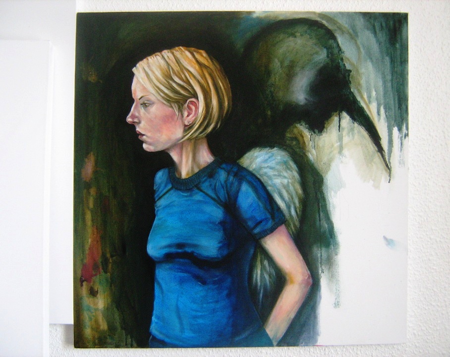
anyhow. the birdman figure has also been given more to do. instead of being a shadowy half-drawn mess off to one side, he's a part of. . . whatever's going on (imaginations people, use them), even if only as a spectator. his darker clothing keeps the very colourful arc the other two figures make unbroken.

at a little larger than A3 this is a smaller piece than those i've been painting, and also came a little more naturally. it was painted entirely in acrylics - some colours straight from the tube, such as the grass - which as ever, made its completion a lot less drawn out. there is even some matallic silver paint in there, which. . is a first.

it's not finnicky and i didn't strive to make it 'perfect' as i'd once have done, but i like it - what more can i say?

Wednesday 16 June 2010

Winter Paintings, 3.

right,

summer has arrived - well, in theory - and we're still posting work from winter and spring (which if you live in scotland pretty much amount to the same season) and so, let's get down to some serious posting again.

first up, a composition that will look familiar to anyone who remembers these and their progression from the chaos of dark old october, to earlier this year:


. . . yes?

three drawings of essentially one composition that was sticking, but not. . . quite working out. i added the single 'emma in profile' image there because it was key in getting me from A to B, and to this *deep breath* here:


. . . granted, not in one GO. again, as with the other paintings i've posted recently, the figures here are lifesized. which is hard worker for starters.

this is one of those pieces that was started, abandoned, started again, reworked. . . emma's hair went from full length and curling around her shoulders to the short - barely a - bob in the final image in about three stages, and my clothing was changed at least that many times. from plaid shirt and t-shirt, to coat and superman t-shirt, to closed coat and red t-shirt.

this was clearly an image that wasn't simply fulfilling an old compositional idea and i lost. . . SO much sleep over getting it as far as it got. the faces were repainted, and repainted, the hands - sweet JESUS, don't get me started on those! is emma's right hand tucking itself under my coat because that was my original intention for it? let's just say 'yes' shall we . . . ?

the background too went from plain, to a detailed backdrop which didn't really work, another backdrop, and back to plain again - which was fine except that i then obsessed about getting the colour and tone JUST right. . .

this painting DIDN'T paint itself, then, no, it's not my 'moby dick' - that painting i've YET to try and tackle, but let's just say i HAVE a composition for a painting in my head that will never leave me alone until i paint it - no, but it was harder work than anything i'd painted in a long time. and i will. . AM hard pressed not to go and rework it STILL. i only refrain from doing so because i've been threatened with a kick in the testicles from emma if i DO. . .

. . . i love this, though. i'm proud of it. again, as with the otehr pieces i've done recently, the likenesses are really strong. practise, i guess. i think i did things with colour through trial and error that ended up taking me somewhere new, and somewhere i liked. and there are little details here that i'm incredibly fond of, such as that lovely butterscotch coloured freckle on emma's ear, the ear itself (remember that whole page of ear drawings? came in handy, huh?) the slightly more subtle freckle on her cheekbone, the colouring around her eye, her hair. . . and just the feeling OF the painting.

detailed areas. flat, undetailed areas. emma's hair shorter than it's been since she was about one year old, but it WORKS in the image more than painting her hair longer would have. and i know that because i bloody DID :P

emma pointed out to me early on that we're not quite touching in this. like the drawings i posted where the figures are in that moment before a kiss, this is similar, but it's an embrace ABOUT to happen. she's ABOUT to turn. . . if you see what i mean.

emma also provided a tile, 'shelter' to an otherwise umpteenth untitled piece. anyone who can tell me WHERE she got the title from gets a gold star. . .

anyway. details:


and that, for now, is your lot :)

-iain

Friday 21 May 2010

Drawings 2010, 3.

continuing the year's earlier stuff, these three - more finished looking - drawings are from around the end of february, three variations on compositions i was playing around with, the first of which should look familiar. these three are among my favourite pieces of that period and were more focused breaks from all the loose drawings, and time-consuming paintings. . .

there are all A3 sized and thus, are represented by photographs rather than scans. #11 proved the hardest to photograph because of its very subtle shading here and there, so, bear that in mind. the other two are good representations of the actual pieces though. . .

it should also be noted that straying out of my trusty A4 scale was kind of a big deal for me. . .


11.


remember winter drawing #2? this is a progression ON from that, one of a series of variations and my favourite of the bunch, though there's another less stylised. this one has the subtitle 'freewheelin'', and if i have to explain that *shakes head* give yourself a slap.

this was another step into incorporating more of a background into the image i was producing. there was a lot of messing about drawing very loose building compositions with no figures in that led up to the likes of this, which i like. the other two drawings here are less busy, obviously . . .

there's a painting similar to this to come.


12.


this one, i love - it's kind of an 'iain image' if ever there was one. what i mean by that is that there are images emma says are instantly recognisable as my work by compostion and feeling as well as style, and i think this is one of those.

i like lots about this, i think it works and the likenesses are both really good, as i think is the division between dark and light areas of the image, and the poses. as someone who draws but is his own worst critic, this the kind of image you do five or six drawings for the 'that's okay, that's fine' pile to get to.

side-note: i can't take credit for the stray feathers falling from those great, dark oily wings - those were emma's idea. she does sometimes HAVE these little insights and ideas that i just wouldn't think of for one reason or another, so, credit where it's due. . .

and it's probably unsurprising for me to tell you that a painted version of this is currently 'work in progress'


13.


you can kind of tell this one was drawn around the same time because it shares a lot of linear and tonal qualities, though again it's quite different in feeling to #12 i think. . .

i like this one a lot too. side-note, remember what i was saying a couple of entries ago about emma's hair constantly changing length and that being a kind of artistic license? this is a good example - i deliberately made her hair shorter in this image so that the lovely area where her the back of her neck and shoulder meet and the dark hollow between her jaw and shoulder would be open to the eye. look at the drawing and try to imagine hair obscuring that area and you'll perhaps understand WHY i do these things. the drawing just wouldn't be the same without these little details. the same could be said of the neck on #12.

not that i have a thing about necks. . . . okay, i do, i admit it

*shrug*

i sometimes wonder in posting this stuff if it will be positively recieved, not because i don't think it's good, but because i'll be the first to admit my work has become utterly self-indulgent in the last year, moving away from very anonymous figure compositions and into, well, capturing the woman i love in one way or another and not really doing anything BUT that. i mean you kind of know when iain posts new work, it's not going to be anything other than another visual love letter to the little blonde spitfire, but. . .

i can live with that. i am happy with the stuff i produce, and i long since gave up being someone who paints FOR other people. art's not my career, it's something i do out of a compulsion to express feelings i have about the things around me with meaning, and those things within me that can't be expressed with clumsy words.

if nothing else, it's honest. . .

anyway - that's all for now. next - some more painting. . .

Friday 14 May 2010

Action!

From the sublime to - perhaps - the ridiculous,

At some point early in February I made the following, what was initially to be kind of an oddball Valentines Day gift for Emma, but I was never happy enough with it to hand it over, even though she - inevitably - loved it to bit, it was my first attempt at taking bits and pieces of old action figures and putting them together then sculpting additional details out of VERY fast drying putty, in this case the cardigan, pants, the hair and, well, her bosom.

I then painted the whole thing from scratch with acrylics which had mixed results, mostly because the plastic didn't seem to want to TAKE the paint until you'd put about four coats on. . .

It stands a little taller than five inches, so the first picture's larger than actual size. . .

I don't think it's a bad first attempt at something, I'm just overly critical - But I thought it would be a fun addition to the Blog. . .

That and Emm threatened to publically pants me if I didn't. . .


Wednesday 12 May 2010

Interlude.


Billy Bragg, "Cindy of a Thousand Lives"
-from 'Don't try This At Home', 1991

just one of those ridiculously good songs nobody's ever heard. . .

Monday 10 May 2010

Drawings 2010, 2.

*sigh*

if you don't eat your meat, you can't have any pudding. how can you have any pudding if you don't eat your meat, people? hmm?

so. one year on and my supergirl, my little blonde firecracker continue our journey, and this year so far a few blank canvasses have gone the way of the other paintings thus far - long gestation times - but my propensity to churn out loose drawings or spend hours upon finnicky ones has remained pretty consistent. . .

what's new, or one of the things that IS new is the very process of working which has altered dramatically. the newfound habit of messy ink drawings hashed out to try and capture fleeting ideas and compositions has given me a kind of focus that's led to MORE paintings being STARTED on confident footing. . . even IF they're still taking forever because of one thing or another. . .

anyway. the following is a second portion of drawings, all favourites from around february.


6.


similar to #4, though even more 'finished' in one way, and the one i prefer of the two (emma prefers #4), i think it's just more emma. like #3, again there were areas so heavily worked on that the paper was almost ready to tear, and like #1, this one's kind of all about defining shape, the shape of her nose and lips and eyes. again, it's a bit of a preparatory for a painting along with #1, which i'll be posting soon. . .


7.


this by comparison is more of a sketch. and stylised. if i'd gotten anything out of winter aside from those i've already listed, it was kind of a re-awoken desire for context in my pieces and i began - as you've seen in a couple of other drawings - to draw cafe scenes and to get back into looking at people like edward hopper again. plotting. so we get things like tables, cups and backgrounds and other figures starting to appear rather than flat space.

as a sidenote, emm finds my constant artistic license regarding the length of her hair hilarious. why do i sometimes draw it long and sometimes short? the simple answer is i don't really know. i kind of go with what feels right for a specific image, so sometimes it being short and layered looks better. it's a bit idiosyncratic, i know, but most things about me are. some days i take sugar in my coffee, sometimes sugar and milk, sometimes just black. . .

*shrug*


8.


and THIS one's even sketchier, but is a very good example of what i was just saying about context. background. details. a year ago i'd just neve rhave drawn something like this - but i love this, regardless of its sketchiness and the fact you'd never say 'that's really great', it is what it is and it captures some fragment of my life, complete with desk, cabinets, computer, bookcase, framed comic books on the wall, action figures, headphones. . . and emma. what she's pointing at and saying is entirely open for interpretation, though. you can use your imagination there. . .


9.


and this one. . . is another of those fantastically enjoyable sharpie drawings that on its own is - to me at least - brilliant enough in what it captures and says in the simplest of ways, but. . . i liked it so much i went on to do THIS:


10.


which i don't think needs any commentary. i. . . love this one with a passion, for obvious reasons, but beyond that it just captures so much in such an honest way. i'm very proud of this one. . .

and that's your lot for now

-iain

Friday 7 May 2010

Winter Paintings, 2.

. . . and let's have another one.

this one's 'gestation' - thanks, emma - wasn't quite AS long as that of the last painting, but was another of those pieces that was semi-abandoned for weeks and months at a time, called 'finished' around september but then heavily worked on in december to a point it changed completely - note the length of emma's hair. slight artistic license, but as of right now, not by much - and again, it benefited from being left alone, worked on and left alone again.

i'm really fond of this one, again. i think the colours came out great, especially. . .

Monday 3 May 2010

Drawings 2010, 1.

okay, emm,

(sarc.)

as i said - paintings then drawings til we're up to date. and i decided to jump straight into the 2010 stuff rather than dilly dally around with the dregs of 2009, which i'll post at a later date.

after heavy-going visceral ink, and then lighter post-november drawings, the start of the new year marked a period of just playing around with different ways of drawing, in some cases carrying on with the sharpie-doodle-then-pencil-drawing method of working, in others drawings were a little more finnicky, more textural. but sometimes more linear than anything else, ranging from very stylised to more realistic and precise. there are lots of all of these, but at emma's suggestion, i'll only post four or five at a time. with notes, of course, as ever. . .


1.


done within the last pages of the 'book of emma' this was one of the first things i drew in january and was mostly about trying to capture areas of shading around her neck, collarbones, shoulders, nose and eyes for a painting i was plotting - really just a means to an end, but it ended up being more finished and i love it because it captures more of emma than was intended - the crinkles between her eyebrows and the shape of her mouth - sarah polley teeth and all - especially. the latter, something i usually struggle with. . .

it's a favourite. . .


2.


a much more stylised, sketchy drawing this, and an image that stuck and would be repeated in three or four other drawings before, finally, a painting. i'll post another of these next time, before the painting itself, but i like this one for small details - emm's hair and the birdman's untucked shirt in particular. . .


3.


purely visceral and pretty much scratched with pen so hard into the paper it was nearly torn. i like this because it reminds me of etchings i did in art school. again, it's pushing myself, trying different things, seeing where it takes me rather than sitting doing the same old finnicky drawings. . .


4.


and this one is again a favourite. done in a slightly more relaxed and less frenzied manner to the last drawing, but a lot more precise and with realism a lot more in mind, i enjoyed doing this stuff and went on to do a LOT more of it. to some degree these are descended from all that messy october sharpie work - there are even a few very minimal strokes of sharpie in this one in the bottom right hand corner. . .


5.


aaaand charcoal, something i at that point hadn't used in months and which took a little getting used to again. this was a favourite of the first batch of charcoal drawings i did in january - giving those pens and pencils a rest - and i like this for what it is, as with the others.

i'd gone through a bad patch and through it, wanted something different from both the process of being creative AND what i produced, and these are all indicative of someone not wanting to put all their eggs in one basket.

they're a start. . .

Wednesday 28 April 2010

Winter Paintings, 1.

alright,

correspondence from migraineville - it's been an age.

first off - thanks, guys. one and all for. . . well, for making me feel more okay about posting all this stuff than i expected to, or otherwise would do. after a decade out of art school, a huge chunk of which i was creatively inactive, i feel pretty self-conscious about my work and posting it's sort of a big deal. putting it out there rather than keeping it hidden away being seen by just myself. and emm. who pretty much remains both muse, and boot up my ass when i'm procrastinating or stuck in a rut.

i have a fair bit of work to post still before we're up to date and i'm posting 'current' pieces, but fortunately the 'current' pieces are taking so long that it'll be some time before those are posted anyway. which allows me to spread this stuff out. i could post stuff everyday, but that would be kind of like being bombarded with imagery rather than given time to look at it in bite-sized pieces.

so. posting these was something i didn't want to do in the middle of all those drawings, although i'll be posting my painted stuff from the latter half of last year (not much, given events) one at a time, and posting more drawings between. an entry of a painting, then some drawings, then another painting - capisce?

okay. shall we start then?:

this first piece is, as most of my work is, untitled but has the subtitle 'visible forms'. it's another of those anomalies, a painting that was FIRST started last MAY in it's original very linear form. it was along the lines of those 'ode' paintings. black and white, and i think you can visualise it like that even now. . . but - it just was NOT coming together.

it lay abandoned for some months until the fall when i approached it again, sanded it down a fair bit and began working over the original image in colour, initially planning to paint BOTH figures in the same more realistic palette. and then i got stuck again. weeks later when i went back to it with the idea to carry on, the events of october happened, and with it the spontaneous decision to essentially paint over the birdman character and have him suggested rather than defined.

paint was allowed to dribble, and smear.

from that point on, the painting more or less formed. areas were left incredibly rough and unformed - a patch of canvas where i was mixing fleshtones can be seen on the left side LEFT as it was rather than hidden, and the result is again - maybe - the sense of figure standing in front of something two dimensional. she's standing in front of a very abstract, textural painting of the birdman rather than the birdman himself. . .

oh, and again, these figures are life-sized. i do like working big.

it's not perfect, and there are areas i will correct at a later date, but there's far more i like about what is essentially a painting that was abandoned not once but twice. for now it's set aside to rest, and is posted here as a start.


Friday 2 April 2010

Winter, 3.

so,

just enough time before scooting for easter to make another post here, the third batch of winter drawings. bored of these yet? thought so. anyway- again, selected from a big old pile, this time by both me AND emma. some favourites, some more representational. directional. again, some sketchier than others, some more finished.

but enough of my pointless talk.


20.

more dying sharpie, used deliberately for effect rather than a fresh pen. this was another image i'd been carrying around in my head and for once managed to execute it almost exactly as i saw it. i like this one a lot. . .


21.

. . . this meanwhile is one of emma's picks. there's nothing to it and i never really reflected on it as anything other than a slightly goofy doodle. . .


22-25.

various pencil drawings. 22 & 23 are emm's picks, the other two are mine. 22 was a deliberate attempt to draw emma in something OTHER than that damn cardigan that although synonymous with her (to me at least) i'd gotten into the habit of just automatically drawing, in spite of the fact she scarcely wears the thing anymore. 23 leans towards being more stylised. 24 & 25 meanwhile are favourites of mine, and depictions of emma in 2002, and 2009 respectively. 24 i'm especially fond of.


26.

this one's very sketchy but i love it probably more than anything more 'finished' here. it was sketched during a reflective period shortly before christmas, thinking about the couple of months that had led to that point, and this was what came out. the title, 'hymn' just seemed fitting somehow. . .


27.

this by contrast is probably the most intricate, finnicky, finished drawing of all of these 'winter' drawings, done around the same time as 26 (and also, 19) and featuring a partick glasgow skyline, and one of the best drawings of emma i've ever done, as well as certainly the most realistic looking wings i've ever drawn - as opposed to very stylised flat shapes. detail. lots of detail. i love this. we both love this.


28.

by contrast, this is that more stylised execution again. albeit in differing amounts, lending the possibility the figure is standing in front of a drawing of a building rather than a building itself. the bird on his shoulder is halfway there, but wouldn't look nearly as good done realistically. she's a small quirk, but my favourite part of this image.


29.

'?'


. . . emma picked this one- you can tell. make of it what you will. . .

and that's all for now.

next time, something completely different. . .

Saturday 27 March 2010

Winter, 2.

Alrighty then,

Much delayed follow up to that last post, mostly procrastination on my part and the usual headaches, literal and otherwise.

Again, these are a mixed bunch. Selections from the big pile - Some sketches, some little more than doodles and others more refined than a lot of the preceding stuff I'd been churning out. Variations on repeated themes and images, further attempts to incorporate more of a background as well as full figures into images. Again, some of these images show up in later drawings and at least one painting, more refined. Those you'll see, in time. . .

You can view these as a continuation of a period where I was back enjoying the simple process of sitting and drawing without ever getting critical about what I was doing. Just taking my time, trying things, seeing what I could come up with. . .


9-11.

Like #5 & #6, these are a rough ink drawing that serves as kind of a try-out or rough for - i this case - two pencil drawings, variations of the same poses and composition, though both feel very different, emotionally speaking. These are two of four or five, incidentally. This was an image that I was a little obsessed with capturing in JUST the right way, and these two drawings are essentially my favourites of the bunch.


12 & 13.

Again, same concept - Pen drawing and then a more refined second drawing, in this case done in a mix of pen and pencil. While still fairly rough, as with #10 & #11, I love the resulting image, the composition, the feel of it. It says what I want it to say which no amount of finnickiness ever could.


14.

There's almost nothing to this sketch, but I love it. Real indie comic book splash-page composition.


15.

Again, there's pretty much nothing to this small doodle. And it is little more than a doodle. But again, I love it. A more polished, finished painted version of this composition I'll post at a later date.


16.

Done around the same time as #15, again there's very little to this one. It was just an idea, an image I had in my head I wanted to get down on paper. I like this. It's not great, but it looks unlike anything else I've drawn and has a certain dynamism to it that I find appealing.


17.

Again - imperfect, but I love this image, and it's one I'd had in my head for a long, long time but never put down on paper before this, but which I went on to do more versions of. Yes it's a little goofy, and the birds are stylised rather than realistic, but. . . *shrug*


18.

Another Sharpie begins its slow death with this one, which I utilised by using the smudgey inklessness to express texture, using a new pen on parts like the coat to make them stand out. This, again, is an image that spawned variation after variation but again, was me pushing myself to include architecture, perspective and whole figures. well, at least ONE. I'm extremely fond of this one, particularly the depiction of Emm which I think is one of the best I've done of her.


19.

And #18 could be said to have spawned this drawing, another favourite of mine. I love this. Again, it's not perfect but I care very little about perfection anymore.

Emm, Edinburgh, Forbidden Planet - a very full drawing with a background, foreground and even stuff in the middle. Architecture, at least one full figure - shadowy or not - This was sort of a breakthrough. The beginnings of one, at least. Through which much of my long lost confidence started to slowly rebuild itself.

None of which would have happened without all that had happened in the weeks before, I think. I don't know. . .


. . . More next time.