correspondence from migraineville - it's been an age.
first off - thanks, guys. one and all for. . . well, for making me feel more okay about posting all this stuff than i expected to, or otherwise would do. after a decade out of art school, a huge chunk of which i was creatively inactive, i feel pretty self-conscious about my work and posting it's sort of a big deal. putting it out there rather than keeping it hidden away being seen by just myself. and emm. who pretty much remains both muse, and boot up my ass when i'm procrastinating or stuck in a rut.
i have a fair bit of work to post still before we're up to date and i'm posting 'current' pieces, but fortunately the 'current' pieces are taking so long that it'll be some time before those are posted anyway. which allows me to spread this stuff out. i could post stuff everyday, but that would be kind of like being bombarded with imagery rather than given time to look at it in bite-sized pieces.
so. posting these was something i didn't want to do in the middle of all those drawings, although i'll be posting my painted stuff from the latter half of last year (not much, given events) one at a time, and posting more drawings between. an entry of a painting, then some drawings, then another painting - capisce?
okay. shall we start then?:
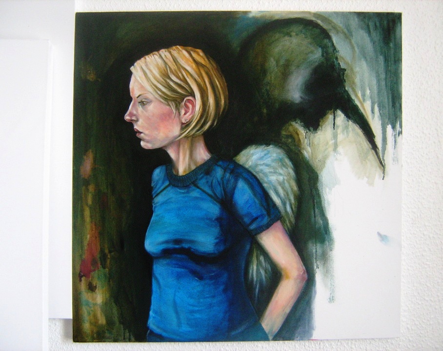
this first piece is, as most of my work is, untitled but has the subtitle 'visible forms'. it's another of those anomalies, a painting that was FIRST started last MAY in it's original very linear form. it was along the lines of those 'ode' paintings. black and white, and i think you can visualise it like that even now. . . but - it just was NOT coming together.
it lay abandoned for some months until the fall when i approached it again, sanded it down a fair bit and began working over the original image in colour, initially planning to paint BOTH figures in the same more realistic palette. and then i got stuck again. weeks later when i went back to it with the idea to carry on, the events of october happened, and with it the spontaneous decision to essentially paint over the birdman character and have him suggested rather than defined.
paint was allowed to dribble, and smear.
from that point on, the painting more or less formed. areas were left incredibly rough and unformed - a patch of canvas where i was mixing fleshtones can be seen on the left side LEFT as it was rather than hidden, and the result is again - maybe - the sense of figure standing in front of something two dimensional. she's standing in front of a very abstract, textural painting of the birdman rather than the birdman himself. . .
oh, and again, these figures are life-sized. i do like working big.
it's not perfect, and there are areas i will correct at a later date, but there's far more i like about what is essentially a painting that was abandoned not once but twice. for now it's set aside to rest, and is posted here as a start.