Showing posts with label birdman. Show all posts

Tuesday, 22 June 2010

Spring Paintings, 1.

i think given we're into march and april we can call these spring rather than winter paintings. . .

so here goes with what we'll call the first of those, given that most of the 'winter' paintings had gestation periods that went back months and months and these were more of the moment - often based around or directly drawn from drawings done during that dark period of october and november, including this first piece.

so. remember this?


. . . from november. and a recap of what i said about it here:

'This one's REALLY sketchy. Mostly I was approaching transferring a vague image I had in my head to paper in a different, more relaxed approach than trying to commit it to the white in very deliberate lines and found that this way came a lot more naturally. While not precisely as I was visualising what I wanted to put on paper, it's a close approximation. And it didn't end with me getting frustrated and scrunching up numerous attempts. . . Mostly with this, I was just determined to have full figures in a drawing. Instead of my old, over-cropped stuff. And again, arhitecture, no matter how vague. . .'

*

it was, undeniably, an image that had stuck before i even drew it and which was going to continue to stick until it was painted. one or two - bronwen and emma spring to mind - have pointed out how familiar the image looks, and i have drawn similar images in the past which i think i'll dig out another day. . . but i think the composition itself was and is very typical of me and the way i make images. put together figures. something i'll be writing a blog about soon. . .

in the meantime, from that drawing and some months later, came this:


now first up, you can see some obvious alterations - the tall mesh fence has been replaced by a smaller more rustic post and wire fence, which makes the base image immediately less foreboding but also breaks the image up a little more nicely. the posts are crooked, unevenly spaced - i thought this and the very pale, sandy ground would be nice in contrast to the solid, dark urban skyline. likewise, the church building has been made less elongated - again, i wanted some degree of contrast between background and foreground, and the figures are pretty elongated, aren't they?

the poses, specifically emma's are also slightly tweaked. the original rough drawing had been hashing an idea out, this was more of a refinement of the original concept i hadn't quite managed to produce in that drawing - so the pose is more graceful and a little more natural.

as i've said a dozen times the last couple of months, having full length figures in my work was something i had to do, and had to get used to - and i think this one came out really nicely. proportionately, it's her. which i sometimes find hard to achieve - i think i have this subconscious programming to draw and to paint women in particular proportions, and having spent a few years drawing and painting curvier women, going onto a model who couldn't be more petite doesn't really come naturally. to quote sarah, 'she's teeny weeny!'

anyhow. the birdman figure has also been given more to do. instead of being a shadowy half-drawn mess off to one side, he's a part of. . . whatever's going on (imaginations people, use them), even if only as a spectator. his darker clothing keeps the very colourful arc the other two figures make unbroken.

at a little larger than A3 this is a smaller piece than those i've been painting, and also came a little more naturally. it was painted entirely in acrylics - some colours straight from the tube, such as the grass - which as ever, made its completion a lot less drawn out. there is even some matallic silver paint in there, which. . is a first.

it's not finnicky and i didn't strive to make it 'perfect' as i'd once have done, but i like it - what more can i say?

Friday, 21 May 2010

Drawings 2010, 3.

continuing the year's earlier stuff, these three - more finished looking - drawings are from around the end of february, three variations on compositions i was playing around with, the first of which should look familiar. these three are among my favourite pieces of that period and were more focused breaks from all the loose drawings, and time-consuming paintings. . .

there are all A3 sized and thus, are represented by photographs rather than scans. #11 proved the hardest to photograph because of its very subtle shading here and there, so, bear that in mind. the other two are good representations of the actual pieces though. . .

it should also be noted that straying out of my trusty A4 scale was kind of a big deal for me. . .


11.


remember winter drawing #2? this is a progression ON from that, one of a series of variations and my favourite of the bunch, though there's another less stylised. this one has the subtitle 'freewheelin'', and if i have to explain that *shakes head* give yourself a slap.

this was another step into incorporating more of a background into the image i was producing. there was a lot of messing about drawing very loose building compositions with no figures in that led up to the likes of this, which i like. the other two drawings here are less busy, obviously . . .

there's a painting similar to this to come.


12.


this one, i love - it's kind of an 'iain image' if ever there was one. what i mean by that is that there are images emma says are instantly recognisable as my work by compostion and feeling as well as style, and i think this is one of those.

i like lots about this, i think it works and the likenesses are both really good, as i think is the division between dark and light areas of the image, and the poses. as someone who draws but is his own worst critic, this the kind of image you do five or six drawings for the 'that's okay, that's fine' pile to get to.

side-note: i can't take credit for the stray feathers falling from those great, dark oily wings - those were emma's idea. she does sometimes HAVE these little insights and ideas that i just wouldn't think of for one reason or another, so, credit where it's due. . .

and it's probably unsurprising for me to tell you that a painted version of this is currently 'work in progress'


13.


you can kind of tell this one was drawn around the same time because it shares a lot of linear and tonal qualities, though again it's quite different in feeling to #12 i think. . .

i like this one a lot too. side-note, remember what i was saying a couple of entries ago about emma's hair constantly changing length and that being a kind of artistic license? this is a good example - i deliberately made her hair shorter in this image so that the lovely area where her the back of her neck and shoulder meet and the dark hollow between her jaw and shoulder would be open to the eye. look at the drawing and try to imagine hair obscuring that area and you'll perhaps understand WHY i do these things. the drawing just wouldn't be the same without these little details. the same could be said of the neck on #12.

not that i have a thing about necks. . . . okay, i do, i admit it

*shrug*

i sometimes wonder in posting this stuff if it will be positively recieved, not because i don't think it's good, but because i'll be the first to admit my work has become utterly self-indulgent in the last year, moving away from very anonymous figure compositions and into, well, capturing the woman i love in one way or another and not really doing anything BUT that. i mean you kind of know when iain posts new work, it's not going to be anything other than another visual love letter to the little blonde spitfire, but. . .

i can live with that. i am happy with the stuff i produce, and i long since gave up being someone who paints FOR other people. art's not my career, it's something i do out of a compulsion to express feelings i have about the things around me with meaning, and those things within me that can't be expressed with clumsy words.

if nothing else, it's honest. . .

anyway - that's all for now. next - some more painting. . .

Monday, 3 May 2010

Drawings 2010, 1.

okay, emm,

(sarc.)

as i said - paintings then drawings til we're up to date. and i decided to jump straight into the 2010 stuff rather than dilly dally around with the dregs of 2009, which i'll post at a later date.

after heavy-going visceral ink, and then lighter post-november drawings, the start of the new year marked a period of just playing around with different ways of drawing, in some cases carrying on with the sharpie-doodle-then-pencil-drawing method of working, in others drawings were a little more finnicky, more textural. but sometimes more linear than anything else, ranging from very stylised to more realistic and precise. there are lots of all of these, but at emma's suggestion, i'll only post four or five at a time. with notes, of course, as ever. . .


1.


done within the last pages of the 'book of emma' this was one of the first things i drew in january and was mostly about trying to capture areas of shading around her neck, collarbones, shoulders, nose and eyes for a painting i was plotting - really just a means to an end, but it ended up being more finished and i love it because it captures more of emma than was intended - the crinkles between her eyebrows and the shape of her mouth - sarah polley teeth and all - especially. the latter, something i usually struggle with. . .

it's a favourite. . .


2.


a much more stylised, sketchy drawing this, and an image that stuck and would be repeated in three or four other drawings before, finally, a painting. i'll post another of these next time, before the painting itself, but i like this one for small details - emm's hair and the birdman's untucked shirt in particular. . .


3.


purely visceral and pretty much scratched with pen so hard into the paper it was nearly torn. i like this because it reminds me of etchings i did in art school. again, it's pushing myself, trying different things, seeing where it takes me rather than sitting doing the same old finnicky drawings. . .


4.


and this one is again a favourite. done in a slightly more relaxed and less frenzied manner to the last drawing, but a lot more precise and with realism a lot more in mind, i enjoyed doing this stuff and went on to do a LOT more of it. to some degree these are descended from all that messy october sharpie work - there are even a few very minimal strokes of sharpie in this one in the bottom right hand corner. . .


5.


aaaand charcoal, something i at that point hadn't used in months and which took a little getting used to again. this was a favourite of the first batch of charcoal drawings i did in january - giving those pens and pencils a rest - and i like this for what it is, as with the others.

i'd gone through a bad patch and through it, wanted something different from both the process of being creative AND what i produced, and these are all indicative of someone not wanting to put all their eggs in one basket.

they're a start. . .

Wednesday, 28 April 2010

Winter Paintings, 1.

alright,

correspondence from migraineville - it's been an age.

first off - thanks, guys. one and all for. . . well, for making me feel more okay about posting all this stuff than i expected to, or otherwise would do. after a decade out of art school, a huge chunk of which i was creatively inactive, i feel pretty self-conscious about my work and posting it's sort of a big deal. putting it out there rather than keeping it hidden away being seen by just myself. and emm. who pretty much remains both muse, and boot up my ass when i'm procrastinating or stuck in a rut.

i have a fair bit of work to post still before we're up to date and i'm posting 'current' pieces, but fortunately the 'current' pieces are taking so long that it'll be some time before those are posted anyway. which allows me to spread this stuff out. i could post stuff everyday, but that would be kind of like being bombarded with imagery rather than given time to look at it in bite-sized pieces.

so. posting these was something i didn't want to do in the middle of all those drawings, although i'll be posting my painted stuff from the latter half of last year (not much, given events) one at a time, and posting more drawings between. an entry of a painting, then some drawings, then another painting - capisce?

okay. shall we start then?:

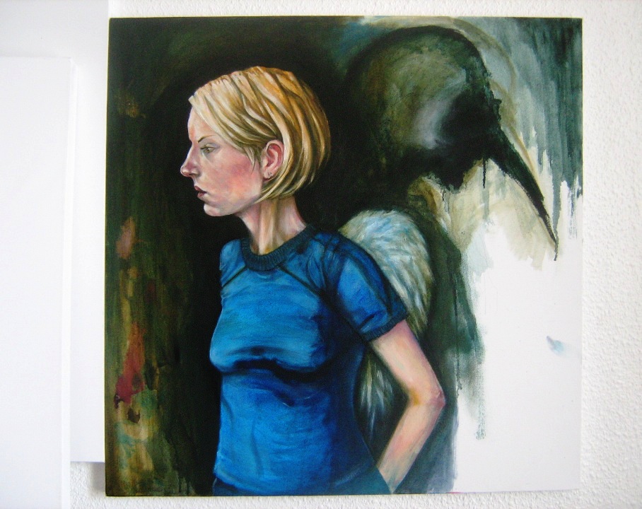
this first piece is, as most of my work is, untitled but has the subtitle 'visible forms'. it's another of those anomalies, a painting that was FIRST started last MAY in it's original very linear form. it was along the lines of those 'ode' paintings. black and white, and i think you can visualise it like that even now. . . but - it just was NOT coming together.

it lay abandoned for some months until the fall when i approached it again, sanded it down a fair bit and began working over the original image in colour, initially planning to paint BOTH figures in the same more realistic palette. and then i got stuck again. weeks later when i went back to it with the idea to carry on, the events of october happened, and with it the spontaneous decision to essentially paint over the birdman character and have him suggested rather than defined.

paint was allowed to dribble, and smear.

from that point on, the painting more or less formed. areas were left incredibly rough and unformed - a patch of canvas where i was mixing fleshtones can be seen on the left side LEFT as it was rather than hidden, and the result is again - maybe - the sense of figure standing in front of something two dimensional. she's standing in front of a very abstract, textural painting of the birdman rather than the birdman himself. . .

oh, and again, these figures are life-sized. i do like working big.

it's not perfect, and there are areas i will correct at a later date, but there's far more i like about what is essentially a painting that was abandoned not once but twice. for now it's set aside to rest, and is posted here as a start.


Friday, 2 April 2010

Winter, 3.

so,

just enough time before scooting for easter to make another post here, the third batch of winter drawings. bored of these yet? thought so. anyway- again, selected from a big old pile, this time by both me AND emma. some favourites, some more representational. directional. again, some sketchier than others, some more finished.

but enough of my pointless talk.


20.

more dying sharpie, used deliberately for effect rather than a fresh pen. this was another image i'd been carrying around in my head and for once managed to execute it almost exactly as i saw it. i like this one a lot. . .


21.

. . . this meanwhile is one of emma's picks. there's nothing to it and i never really reflected on it as anything other than a slightly goofy doodle. . .


22-25.

various pencil drawings. 22 & 23 are emm's picks, the other two are mine. 22 was a deliberate attempt to draw emma in something OTHER than that damn cardigan that although synonymous with her (to me at least) i'd gotten into the habit of just automatically drawing, in spite of the fact she scarcely wears the thing anymore. 23 leans towards being more stylised. 24 & 25 meanwhile are favourites of mine, and depictions of emma in 2002, and 2009 respectively. 24 i'm especially fond of.


26.

this one's very sketchy but i love it probably more than anything more 'finished' here. it was sketched during a reflective period shortly before christmas, thinking about the couple of months that had led to that point, and this was what came out. the title, 'hymn' just seemed fitting somehow. . .


27.

this by contrast is probably the most intricate, finnicky, finished drawing of all of these 'winter' drawings, done around the same time as 26 (and also, 19) and featuring a partick glasgow skyline, and one of the best drawings of emma i've ever done, as well as certainly the most realistic looking wings i've ever drawn - as opposed to very stylised flat shapes. detail. lots of detail. i love this. we both love this.


28.

by contrast, this is that more stylised execution again. albeit in differing amounts, lending the possibility the figure is standing in front of a drawing of a building rather than a building itself. the bird on his shoulder is halfway there, but wouldn't look nearly as good done realistically. she's a small quirk, but my favourite part of this image.


29.

'?'


. . . emma picked this one- you can tell. make of it what you will. . .

and that's all for now.

next time, something completely different. . .

Sunday, 21 March 2010

Winter, 1.

So,

November into December.

To some degree these are more of the same, in other ways some of what I did when things had cooled down a bit was a step back. Not a big step forward, but just doing - and the desire to do - pieces that were a little less intense and demanding. Understandably.

This first selection is mostly random. While not churning out pieces as I'd been doing, I was still producing more than I had been and being a lot less finnicky. And yes the drawings are a lot less finished looking than my 'usual' work, but again, the idea of sitting spending hours on finnicky, precise drawings had lost its appeal.

The pen would to some extent a backseat in favour of pencil by the middle of December, by which point it had taken on a slightly different role. . .


1.

The bird mask minus its owner. I wanted to draw just this as a way of separating the two, that and to try and do something resembling a design of the mask itself because it's always been a bit vague and amorphous, and generally been drawn / painted in profile. I like this.


2-4.

Three Emma drawings of slightly differing style and levels of realism that pretty much speak for themselves. Straightforward with no underlying bleak story. Just drawings.


5.

This one's REALLY sketchy. Mostly I was approaching transferring a vague image I had in my head to paper in a different, more relaxed approach than trying to commit it to the white in very deliberate lines and found that this way came a lot more naturally. While not precisely as I was visualising what I wanted to put on paper, it's a close approximation. And it didn't end with me getting frustrated and scrunching up numerous attempts. . . Mostly with this, I was just determined to have full figures in a drawing. Instead of my old, over-cropped stuff. And again, arhitecture, no matter how vague. . .


6 & 7.

Now then. Here's where things took a bit of a turn, which sort of speaks for itself - Sharpie drawing as preparatory study. This out of the blue became a 'thing', a habit which led to the production of some great drawings I really love, minus the stress of being finnicky because I'd bashed out the basic concepts first. Admittedly, not the original plan but just something that. . . happened, pottering around, drawing.

And again, full figures, something I've avoided for years. And years. Oh, and years.

The pencil piece itself I like and don't in equal measures, but that's just me doing what I do best - Being my own worst critic.


8.

Simple. Again with these, no explanation necessary. I was just getting back to enjoying drawing again, without it being about thrashing emotions out of my system. I think it probably shows.


9.

One of my favourites from that period of late November into December. There's nothing to this but I love it. Sharpie and pitt pen for the thinner lines. I couldn't have done something like this in pencil. It wouldn't have 'felt' as this one does. if that makes any sense at all. . .

And that's all for today.


Sunday, 14 March 2010

opoponax, 3.

. . . i think i'll skip a large chunk of the rest. the stuff following on from that last batch into, well, i think its direction was fairly clear. and i feel more negative about posting that stuff today than otherwise, so. . .

another time, maybe. but probably not. anyway. . .

these eleven images are kind of representational of the end of that dark period. we're into november now - the lines are less gnarly, have taken on a different quality altogether in places and there's a definite narrative going on from one image to the next - though we're looking at selections here, not the whole pile - i think you can pretty much see the tension ebbing away. . .

also, yonder pajama wearing skeleton has become something more fully formed than the inky mess that first manifested. . .


34.

this is somewhat out of place in a way, a pencil drawing amongst all that solid black and white, but i wanted to post this because i like it, and because, like previously, backgrounds are creeping into my stuff in the form of interiors as WELL as exterior scenery, as seen here in the shape of, well, my kitchen. this was fast and done with more or less the same ethic as the ink drawings had been done with - don't worry about portraying what you see so much as what you feel. so while it's slight as drawings go in one sense, it's another step somewhere new. . .


35 & 36.

35 is sort of an anomally. the birdman figure was an abandoned piece from weeks earlier which i just randomly looked at one evening and said 'this needs another figure', which kind of went against my newfound habit of doing the drawings, leaving them and doing something else. a few corrections were made - which i regret now because they stick out like a sore thumb - in white ink, and a more straightforward self-portrait was added. i think. . . this is one of those pieces that has a narrative undercurrent, which 36 carries on with. 36 is noteable for being botha little less stylised, and for the fact that it was done in my trusty sharpie's - the second, actually - death throes. . .


37.

this one's open for interpretation, but even i don't know what's going on in it. i love this, though, mopstly for small things like emma's hair, my general dishevelled appearance - and the first appearance of the new suit and tie MASKLESS birdman look - the positioning of the fence, compositionally and by no means last or least, our skeletal oddball looking. . . well, skeletal. . . again though, definite narrative suggestion here. that illustration degree not going completely to waste, then . . .


38 - 40.

a mixed bag of stylized, random goofiness - 38 - further exploration of cityscape backgrounds and composition - 39 - and looser scratcvhing around with a new sharpie, seeing what can be come up with on one very white sheet of A4. i think by this point i'd become equally fond of that damn skeleton and the fully realised owl mask, but eprhaps even more fond of the medium itself. . .


41.

there's almost nothing to this. i don't think it could be any more minimal - and yet, i don't think i could love it any more than i do. . .


42.

the final three images - for today at least - are completely random and polar. i don't think they could be more different from each other. this one, i think, is a favourite of mine from a small pile of mask drawings i did around this time kind of. . playing around with how the character had looked and how i wanted him to go. i'm not sure why this one stands out for me, i just like the lines. . .


43.

bizarre that my hand should ever draw such a thing. do i necessarily like this? no. but the oddness of me drawing it lends its right to a place here. it's another small part of where we're going. this is kind of a landmark of ugly dundee architecture, a tower building belonging to the universtity which. . shows up less stylised in the background of at least one later piece you'll see. . . soon enough. . .


44.

. . . needs no commentary, explanation, or words of any kind.

Friday, 12 March 2010

Opoponax, 2.

. . . second batch? yes.

these are. . . different. time went on, the ratio of scrunched up balls to drawings changed drastically, and the paper-attack look lessened. they became less severe as my circumstances settled a little, though subjectively they're still pretty bleak, especially towards the last three or four, by which point. well. i don't want to go there . . .

the selection process for these was part random and part humming and hawing. between this post and the next, last post of these drawings which lead into my newer stuff that i'm far less conflicted about, there are a couple of dozen leftover pieces that i'll post at a later date, i think.

some of these are a little obtuse. some get very stylised. some are more straightforward. . .

anyway. in all their black and white sharpie and paper glory, with commentary:


19.

one of a bunch of owl-mask drawings. i picked this one because of the additional detail. it's not just sharpie and i like the contrast of teh thick lines and thin detail lines and that there's more tone to thios than just black and white.


20 & 21.

he of the striped pajamas again. it should be clear that he really CREPT into the stuff i was producing given how unformed the first few drawings are, even the first one here. they're working towards forming a character. 20 i added because i both love the pure expressionism of the top drawing, and the oddball nonsense of the second - and both on one page.

there's nothing i don't love about 21. and 21 is the first fully formed image of this new odd addition to my rogues gallery of characters. minus the big black wings he was wearing in 15. those have been inherited by the soon to be maskless birdman. make of that what you will. . . also, this marks the beginnings of actual ARCHITECTURE showing up in my drawings instead of plain untouched backgrounds. which is. . . sort of a big thing. . .


22 & 23.

. . . and speaking of architecture. these were random, odd, sketchy. sharpie again, with that more detailed addition of a thinner drawing pen in 23, the more 'complete of the two. i did a bunch of these, and picked two sort of at random to show the difference between the looser ones and the more finished - vaguely - drawings.


24.

a straightforward birdman drawing. but i love this one passionately.


25 & 26.

and it's HIM again. i think there's an odd thing with this character in that as grim as he is, he seems more court jester than grim reaper. i picked these two because i love how gnarly he looks in 25, and how utterly ridiculous and random the notion of him doing his 'sound of music' routine is', even though said drawing is pretty much just a mess of black ink. but come on, wouldn't you rather see a skeleton in stripey PJ's than julie andrews? i know i would. . .

comic relief in hard times? i think so. . .


26 - 33.

i'll leave these without commentary. i wasn't going to post these, and i may NOT keep them up indefinitely, so. they're kind of a return to the darker tone of some of the early drawings in that last post, with reason. take them and interpret them as you will.